

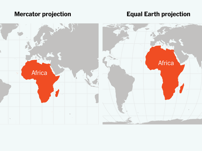
Africa is far bigger than it looks on many world maps. Here is why the continent appears smaller, how map projections distort its size, and what the true size of Africa means for how the world sees the continent.
Have you ever looked at a world map and wondered why Africa does not appear as large as you expected?
The answer lies in the way the Earth is represented on a flat map.
Africa covers about 30.3 million square kilometres, making it the second-largest continent in the world. It accounts for roughly one-fifth of the Earth’s land area and is larger than the United States, China, India and several European countries combined.
Yet on the familiar world map used in classrooms, offices and online, Africa can look surprisingly modest.
That visual impression is misleading.
Why Africa Looks Smaller on the World Map
The Earth is roughly spherical, but a conventional map is flat. Converting a globe into a flat surface inevitably distorts geographical features.
One of the most widely known examples is the Mercator projection, developed by Flemish cartographer Gerardus Mercator in the 16th century.
The projection was designed primarily for navigation. It preserves direction and angles, making it particularly useful for sailors plotting courses across the oceans.
But there is a major trade-off: areas become increasingly exaggerated as they move away from the Equator.
Africa is positioned largely in tropical and subtropical latitudes, while countries and territories extending towards the Arctic appear much larger than they actually are.
This is why Greenland can appear almost as large as Africa on some world maps, even though Africa is more than 14 times larger in actual land area.
Russia, Canada and parts of northern Europe are similarly enlarged on the Mercator projection.
The True Size of Africa
The numbers tell a different story from the map.
Africa’s approximately 30.3 million square kilometres make it enormous by global standards.
The continent is large enough to contain the United States, China, India and several European countries while still leaving considerable space.
Its geographical scale is also reflected in the distances between its major regions.
From the Mediterranean coast in the north to the southern tip of the continent is several thousand kilometres. From the Atlantic coast in the west to the Indian Ocean in the east is similarly vast.
That scale matters.
It affects transportation, trade, infrastructure, telecommunications, energy development, agriculture and the movement of people and goods across the continent.
More Than a Map Problem
The distortion of Africa’s size is not simply a cartographic curiosity.
Maps influence how people understand the world.
For generations, millions of people have encountered world geography through maps in which Europe, North America and northern Asia appear disproportionately large.
Africa, meanwhile, appears comparatively compressed.
The issue is not that the Mercator projection is an inaccurate map for its intended purpose. It is that people often use it to make comparisons of land area, for which it was never designed.
A map can therefore be technically useful while still giving a misleading visual impression of relative size.
Africa is Not One Small Region
Understanding Africa’s true geographical scale also helps explain why the continent cannot be treated as a single, uniform place.
Africa is home to 54 countries, thousands of languages and cultures, major economic centres, vast agricultural regions and enormous differences in climate and terrain.
The Sahara stretches across much of North Africa, while the Congo Basin contains one of the world’s great tropical rainforest regions.
The continent also has extensive savannas, mountains, rivers, forests, deserts and coastlines.
Economic conditions vary just as dramatically.
Nigeria’s economy and population dynamics are different from those of Egypt. Kenya is different from Senegal. South Africa is different from Ethiopia.
The size and diversity of the continent make sweeping descriptions of “Africa” increasingly inadequate.
Why Africa’s Size Matters Economically
Geographical scale has practical consequences.
Building a railway across several African countries can involve thousands of kilometres of track. Connecting cities with highways, electricity grids or fibre-optic networks requires enormous investments across difficult terrain and national borders.
The same applies to intra-African trade.
A business moving goods between major African markets may have to cover distances that would be comparable to crossing several countries in other parts of the world.
Africa’s size also contributes to its enormous resource base.
Oil and gas, critical minerals, agricultural land, forests, fisheries and renewable-energy resources are distributed across a continent of extraordinary geographical breadth.
Seeing Africa at its true scale therefore provides a better understanding of both its challenges and its potential.
Are There Better Maps?
Yes.
Not every world map is designed for navigation.
Equal-area map projections attempt to preserve the relative size of land masses. The Gall-Peters projection is one example, while the Mollweide and Equal Earth projections also provide useful alternatives when comparing continental areas.
A globe remains an even simpler way to appreciate the Earth’s proportions because it does not require flattening the planet onto a rectangular surface.
The important point is to understand what a particular map is designed to show.
A map that is excellent for navigation may not be the best map for comparing the size of Africa with Europe, North America or Greenland.
The Bigger Lesson
The true size of Africa on the world map is ultimately about more than cartography.
It is about perception.
When a continent covering more than 30 million square kilometres appears visually reduced, it can subtly influence how people understand its geography, diversity and global significance.
Africa is not a small landmass below Europe.
It is a vast continent stretching across enormous distances, containing 54 countries, extraordinary natural diversity and some of the world’s fastest-growing populations and economies.
The next time you look at a world map, remember that what you see is not necessarily what the Earth looks like.
Africa is much bigger than the map makes it appear—and understanding that difference matters.
